How do you utilise a well-defined brand guideline to create a yet to be defined illustration style?
Disjointed. DePuy Synthes, one of the world’s leading orthopaedic companies had recently launched new brand guidelines with the aim of building greater consistency, uniformity and visual presence across its many franchises. The new branding was represented by a ‘red thread’ graphic. Although the new guidelines clearly showcased how product and campaign imagery should be portrayed, it was less clear when it came to recommending a defined illustration style. Anatomy illustrations are the bedrock of orthopaedic imagery, spanning product brochures, surgical techniques and conference posters. Current illustration styles appeared to be too varied and disjointed across different franchises like Trauma, Knees, Shoulders, to name a few. Following a competitive pitch process, we were invited to define a new style guide for all DePuy Synthes medical anatomy illustrations going forward.
Between the lines. As part of our in-depth approach to design, we undertook several deep dives to better understand the visual world of the new brand guidelines. Working closely with the Johnson & Johnson brand team, we shortlisted several exploratory illustrative routes, arriving at a new style that seamlessly tied in with the new guidelines.
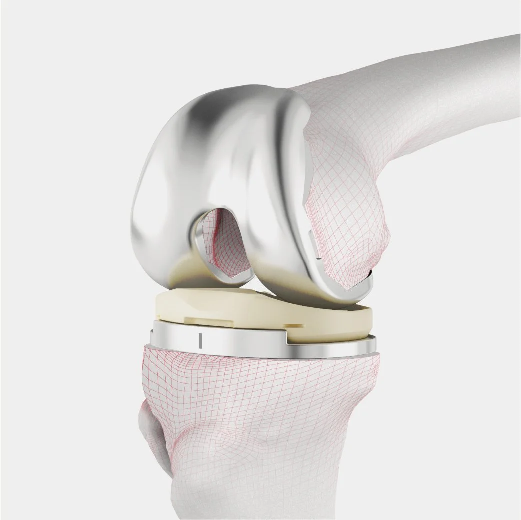
Joined-up. Our approach was inspired by graphics used in 3D anatomical scanning. The idea to adopt this style not only complimented the overall ‘red thread’ graphic, but also helped tie-in the patient-centric, medical technology ambition of the company.


